Mikata

Product design Strategy

Helping Wholesale Businesses Streamline Their Sales Process
Fallback Image

About

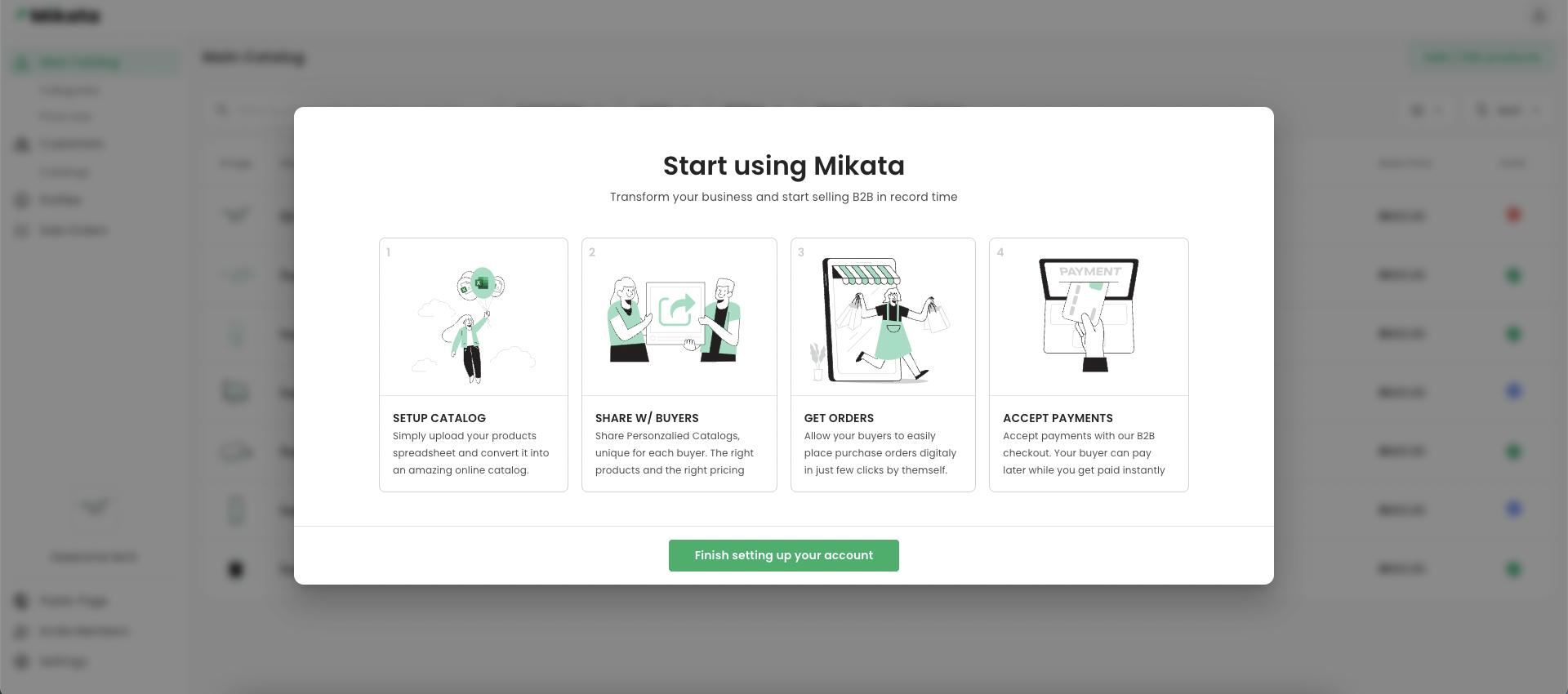
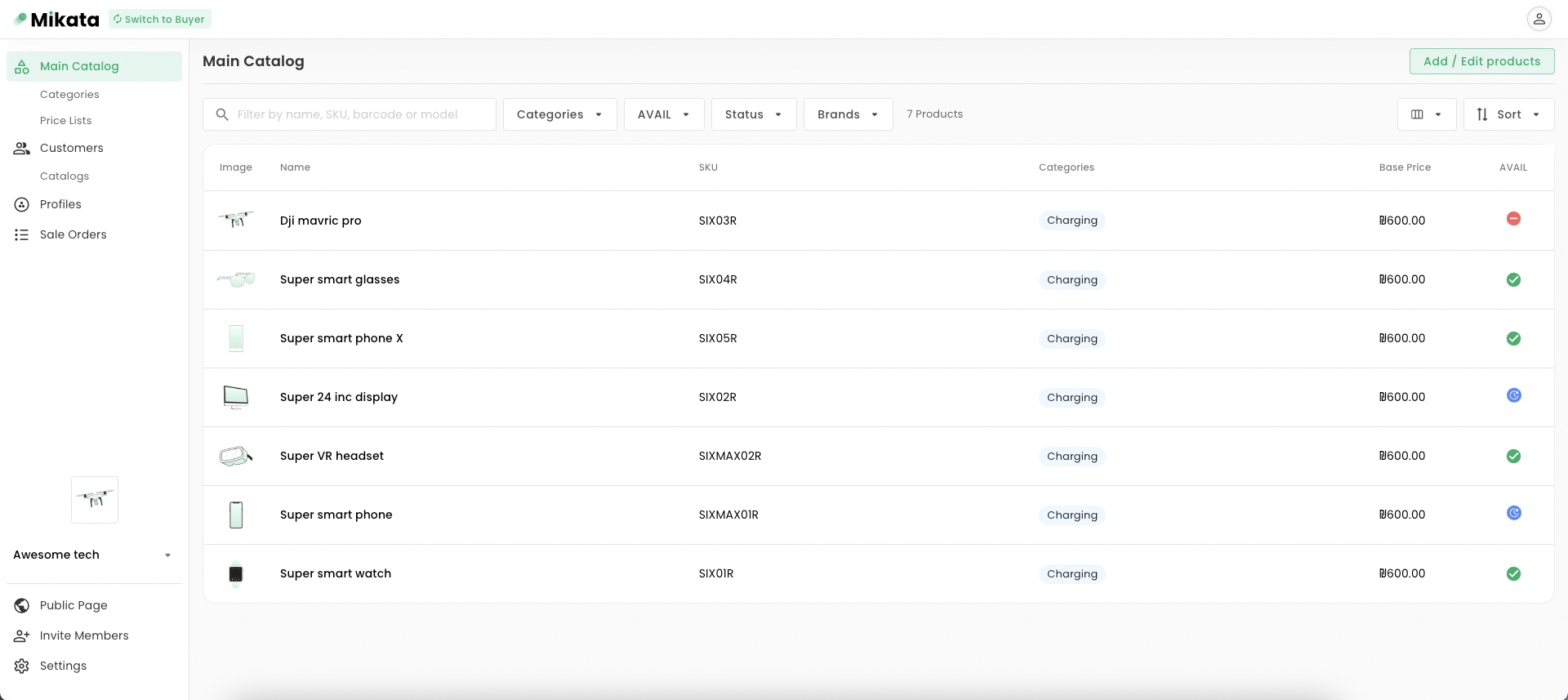
Mikata is a B2B e-commerce startup that aims to modernize wholesale business operations by providing a centralized platform to manage catalogs, price lists, customers, orders, invoices, and payments.
Mikata website

Overview

Role

Design lead

Team

CPO

Backend developer

Frontend developers

Tools

Figma

Devices

Desktop

Tablet

Mobile

Duration

2022 - Current

The problem

The B2B e-commerce sales cycle requires significant time and effort

Outdated methods like offline spreadsheets and mail/phone communication are still common among SMB wholesalers, leading to a broken sales cycle that requires significant time and effort.

The solution

A user-friendly platform streamlines wholesale business

By enabling easy catalog management, streamlined order placement, and on-the-spot payment, the sales cycle can be made more efficient, benefiting both wholesalers and buyers.

Solutions breakdown

Your Image

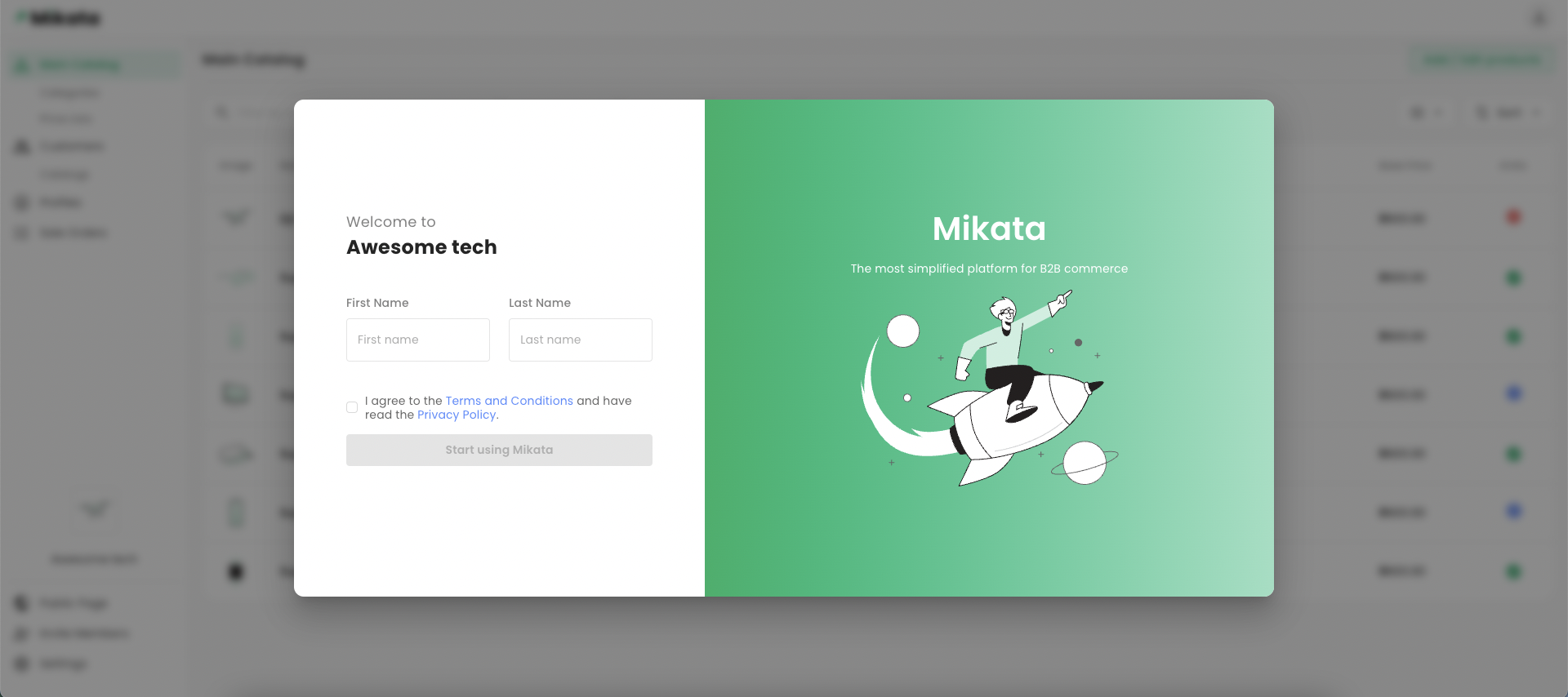
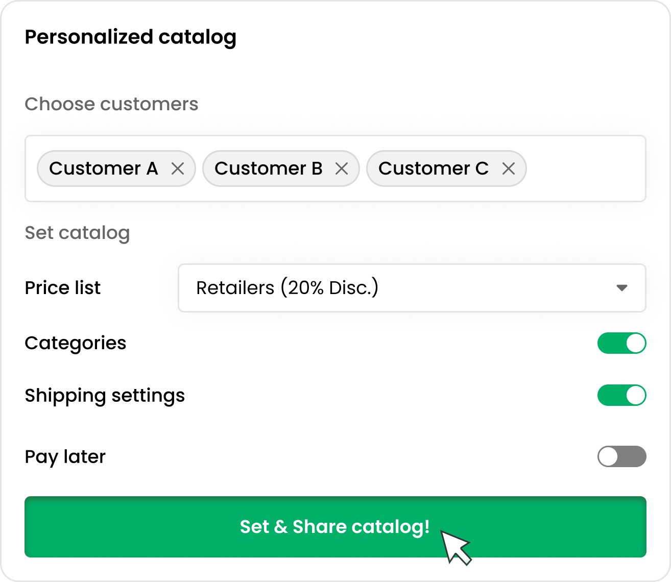
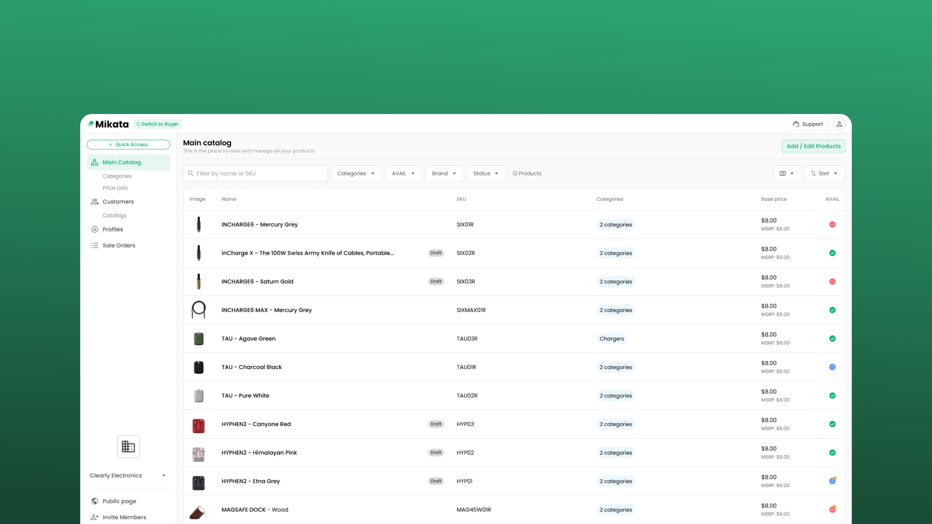
Creating and sharing personalized catalogs easily

Before: Creating personalized catalogs and tailored terms for each customer was a time-consuming and labor-intensive process that required significant manual effort.

After: The Mikata platform enables personalized catalog creation and tailored terms for each customer, streamlining the process and saving valuable time and resources.
Your Image

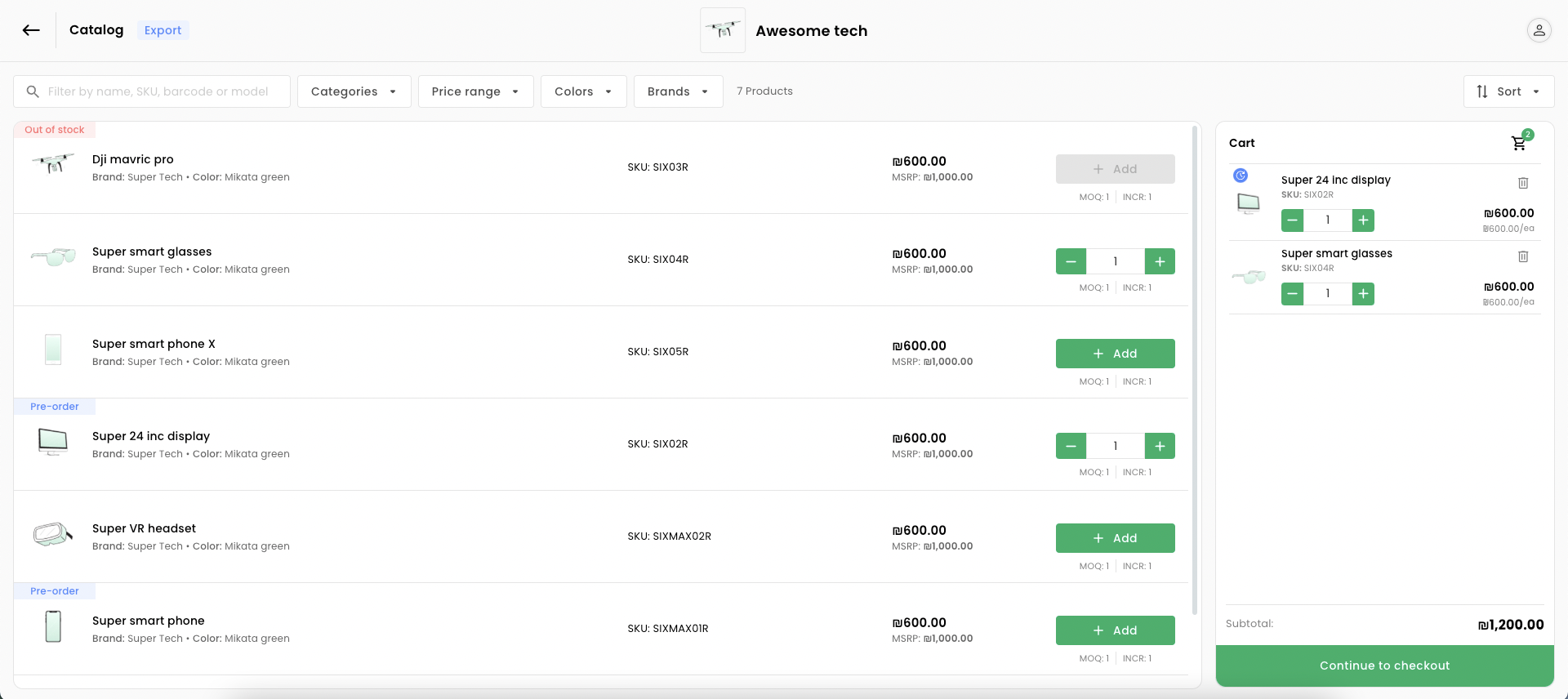
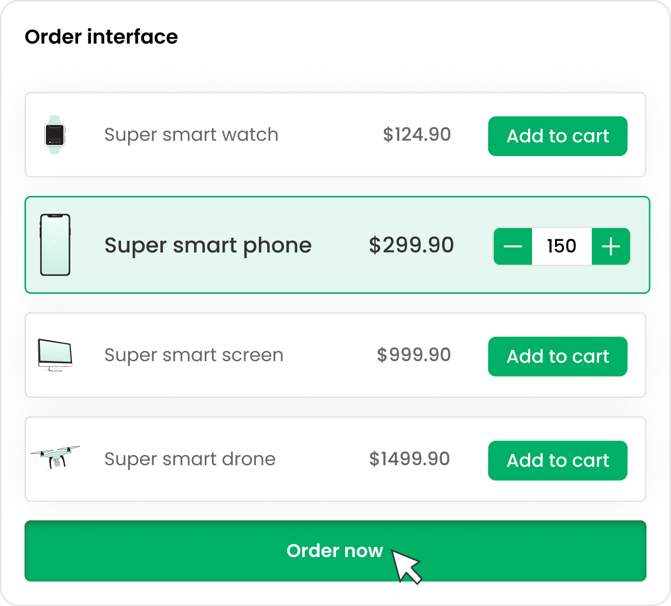
Buyers get a tailor-made order experience

Before: Customers needed to access their personalized catalog through an email, followed by navigating an offline spreadsheet, which was a cumbersome and time-consuming process.

After: One-click access to a personalized catalog simplifies ordering for customers, with no sign-up required, making the process more efficient and user-friendly.

Your Image

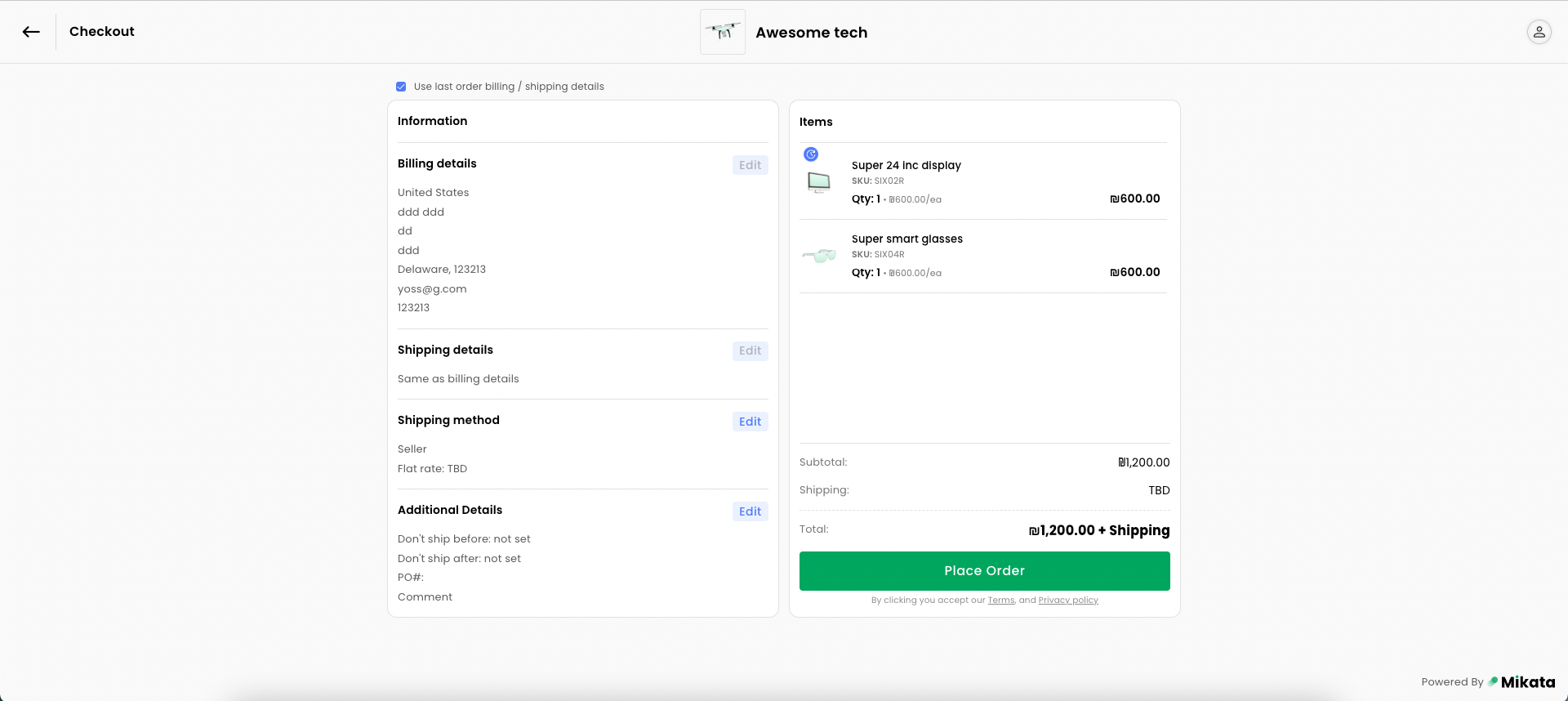
Wholesale checkout made easy

Before: Wholesalers struggled with an unorganized approach to managing payments and shipping options, which resulted in a chaotic and headache-inducing process.

After: The new system allows customization of payment and shipping options, offers net terms to customers, and simplifies transaction management, leading to a more streamlined and efficient process.

Design process

User research

Retailers expect enhanced shopping experience, while wholesalers seek to optimize their sales efficiency.

Wholesalers - Key user

  • - Small and midsize business from the USA.

  • - The wholesalers aged between 40-50, have has a few employees and they are not very tech-savvy.

  • - Their primary concerns is that adopting a new system might negatively impact their sales.

  • - They are also concerned that their customers may not be willing to adopt the new system

  • - The wholesaler's objectives are to boost sales and reduce the time spent on manual work in the sales process.

Retailer buyers

  • - Retailer buyer have high expectations, similar to those in B2C shopping

  • - Retailer buyer expect customized pricing, product catalogs, and item selection tailored to their specific requirements.

  • - Retailer buyer expect flexibility on how they order and pay

Getting the data

Throughout the process, we collaborated with design partners, engaging in daily discussions to identify their needs and preferences. We aimed to understand which features were missing or could be improved, as well as which aspects were working well for them. This continuous dialogue enabled us to tailor our design to better address user requirements and enhance the overall user experience.

Building a Smart and Efficient Design System with Figma's Components.

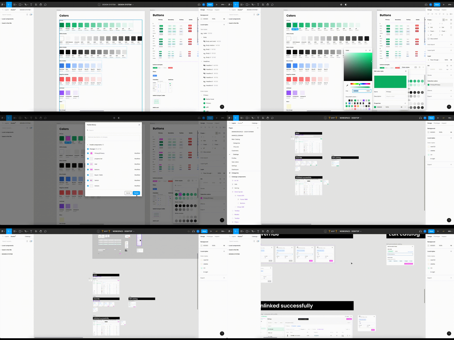
I created a smart design system using Figma's components that streamlined workflow efficiency by incorporating reusable colors, fonts, buttons, and more. One-click changes across the entire system reduced time consumption and enabled faster design iterations.
Here is an example of changing the primary color in the design system and replacing it across the entire system
Your Image

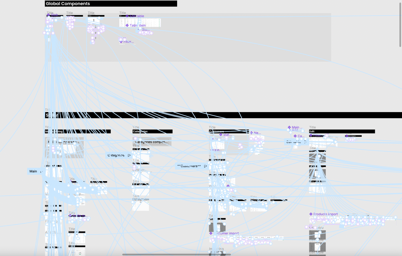
Creating Prototypes to Clearly Understand and Display the System

During the initial stages, before we had a fully developed system, I utilized Figma's capabilities to help the team members better understand the product's processes. The prototypes I created were also employed by the founders to showcase the product at international conferences, as well as to investors and potential customers.
Your Image

Preserving Design Quality through Post-Development Assessments

After each feature was developed and before pushing it to production, I met with the developers to conduct a design review. We ensured that all design elements, such as alignment, colors, hover states, and correct UX flows, were in place and properly executed.

Usability testing

I utilized Hotjar to review user sessions and enhance our UX design. I identified issues and discussed potential improvements with the VP of Product. Together, we worked on ways to effectively improve the user experience based on our findings.

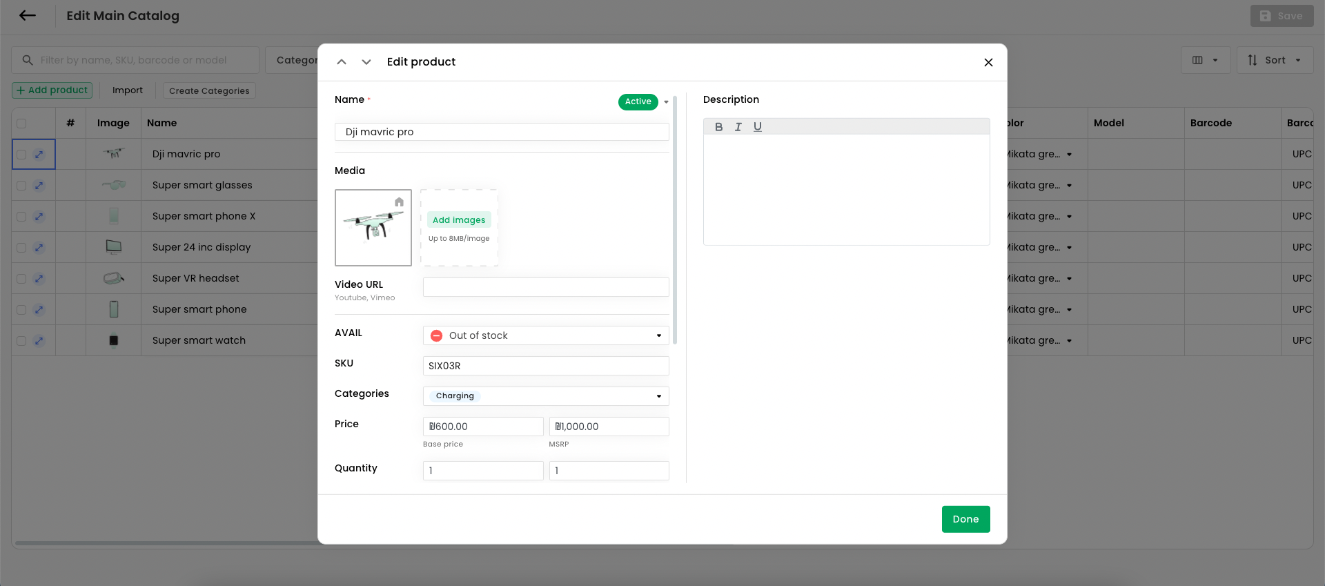
In one case, we noticed a user manually updating categories instead of using the bulk update feature. After informing the user, we decided to enhance the UX to make the feature more intuitive and easily discoverable for all users.

Project takeawyas

  • 1. Collaborating with users and design partners provided valuable insights into UX/UI best practices, enhancing the overall user experience on the B2B e-commerce platform.

  • 2. Utilizing Figma's components in a smart design system enabled faster design iterations, cohesive visuals, and streamlined workflows.

  • 3. Conducting usability testing and post-development assessments helped identify areas of improvement, ensuring the platform met user expectations and addressed their needs effectively.